The book is getting close to going to the printer. I am sending a draft to “the person” who will write the forword, and my graphics artist shot me three book cover ideas.
I would love your feedback on these three covers. Will you please tell me which of the three you love, which you love the least, and WHY? Thank you!
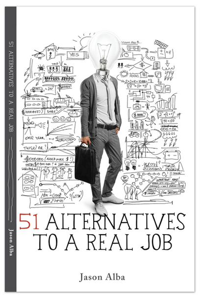
Idea A: Lightbulb Head
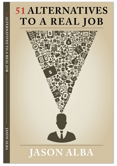
Idea B: Triangle Head
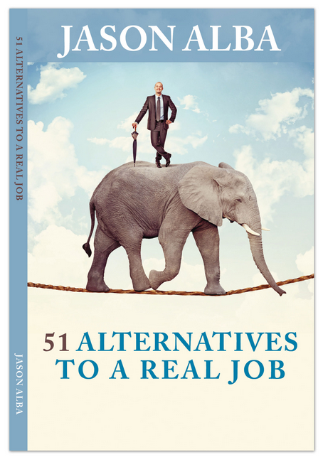
Idea C: Elephant on Tightrope
Please leave a comment of email me (Jason@JibberJobber.com) what you think. Again, I’d love to know your favorite, least favorite, and WHY.
Jason,
The first best conveys the idea of an alternative approach to work. The elephant doesn’t relate. It’s like the elephant insurance commercials, memorable, but not a compelling reason to buy. Just silly.
Jason,
I like #3 – the blue is professional enough for business and appealing enough to attract a reader. The Professional appears to have mastered the beast!!
The first cover looks chaotic and I don’t think this is the message you are trying to send. Finally, cover #2 sends the message that the client is thinking about too much; overwhelmed.
I hope this helps.
I liked the first one, but the last one jumped out and gave me an unexpected belly laugh– and it does fit!
If had my choice of purchasing one of these three books on a display, I definitely would grab the one with the guy with the umbrella on the elephant walking a tight rope to see what’s inside!
Kudos for polling! So many folks don’t and I firmly believe “we can’t see the whole picture when we’re inside the frame”. (Wired TV series)
I may be in the minority but I like #1. Focuses on thinking versus more common options. Also, the choices are not always funneled in a controlled order. Not aware of your content but the 51 options must not only be analyzed and selected, but also initially seen and chosen from a mass of choices that many may not otherwise consider. Your final summary may very well be 1/3, 1/3, 1/3. Good luck.
I like the elephant and i think it really conveys the idea. The blue cover attracts the reader.
I do not like#2: dark colors and stressful
None of the above. 1 and 2 are too cluttered. 3 looks catchy, but I do not get the elephant on a tightrope. Better to have a job seeker on a tightrope with a net below the job seeker.
My first impression without looking at other people’s comments was the elephant as well…it is intriguing and conveys the message of doing something interesting and creative. I think the first one is a bit morbid and the second one is dark and uninviting-
I like the concept in #3 best… the tightrope you walk in doing your passion vs making money. However, I do like the appearance of combining photography with line art as in #2. Maybe you can come up with a way to do that with #3?
I like number 1, but there is something with the guy, I don´t know what specifically but is like he were not according to the context. The bag maybe?
Number 2, OUT!
Number 3, I like it but what it has to be an elephant with the job searching? it is like a nude woman promoting a credit card.
I like the first one. It is bright, optimistic and illustrates that there are lots of possibilities. The middle one is OK (same idea but not as uplifting). I don’t love the elephant unless there’s a pun involved, like the 51 alternatives are the elephant in the room. Also, if you go with #3, shouldn’t that be you on the elephant? 🙂 Maybe it is but it doesn’t look like you in the small size that I can tell.
I prefer #3, it resonates with me. It conveys to me that the man is on the elephants back (weight) rather than the other way around.
I really do not like #1, I would not pick up the book. Can’t say why but it just doesn’t sit right.
I vote for the first one.
And, second choice to the third.
All the best Jesson.
“Man on Elephant” looks like a winner to me with one change. An elephant with his/her trunk up signifies good luck and so the slight change is recommended. Best with the publication.
Like color of #3, but #1 graphics a layout best…
I actually like the third cover with the man standing atop the elephant.
#3 seems to tell the story visually for me
I did not get the elephant.
If I had to choose between 1 and 2, it would be 2. It’s edgy and catchy.
I just pretended I was in the bookstore and noticed what caught my eye. Definitely #3. #1 & #2 are interesting on a intellectual level if you stop and think about what they mean. When your book is on the shelf with hundreds of other books you want the cover that has grab power not the one that is intellectually interesting. The elephant does make sense and does make a compelling point if you think about it, but it has the added benefit of grabbing attention. Best of luck in the launch of your book 🙂
I would actually like to see a hybrid of #1 and #2. I liked the coloring, lightbulb and comfortable attire and stance in #1, but it’s a little too busy, so I would opt for #2, which conveys the myriad of thoughts and ideas being considered. Perhaps #2 can be modified to look more like a swirling funnel and brighten up the background (?) Did not like #3. Thanks for sharing!
Although 3 is colorful, I do not get it. In fact an elephant reminds me of something slow to move or change. Between 1 & 2, I vote for 1. A little more modern, leading edge. 2 reminds of artwork from Harvard Business Review. Very conservative
Drop the ‘Jason’, and put Alba in really big letters and then shop in a pic of woman that looks like Jessica Alba. The book will sell like crazy.
No need to thank me, I am a marketing genius, I know.
Jason, if these are the only three options then I vote for the 1st one. It is simple and conveys the idea supporting the title of the book. The other two options don’t grab me.
I like the first one. It is the one that suggest creative options for the non-linear thinker, which the 2nd one does not because the lines are so structured. I love the visual of the 3rd one, but it doesn’t evoke the same feeling of creativity and possibilities. Also, number three has 2 immediate impressions for me: 1. political and 2. that elephant could cause real trouble if it gets annoyed having the umbrella poking its back.
I like the first one: Lightbulb head. Of the three it seems to have the more current or cutting-edge look.
#1 is a mess!
#2 doesn’t make sense
#3 intrigues me… my FAVORITE!
Hi Jason, I like Idea C – Elephant on a tightrope. It is visually appealing, would stand out on a bookshelf and is intriguing. The other two look complex and a little odd to me. I would be much more inclined to look at and purchase the book cover with the elephant.
The second one is more eye catching. The first one lacks colour and the third looks too much like a self-help book!
Lightbulb head. Visio / Mindmap lends itself to an understanding of options. Triangle head doesn’t relate to me. Elephant on a tightrope, if it was you, Jason, might be of interest, but if it was you juggling kids, house, car, $$ signs, on top of an elephant, now that works for me.
Jason,
I like the first one, if I was in Barnes and Noble I would be most attracted to it. I like the doodles, the red 51, the light bulb and the clothes on the model. The second one makes me anxious and the third one is confusing…because the picture depicts something nearly impossible it makes me feel like your 51 alternatives might be very difficult.
The first cove makes me feel good and positive about your 51 Alternatives…it makes me curious about what they are…it makes me want to buy the book.
I hope this helps,
Beth
The first option suggests to me that the target audience is under 30. Being a good deal past 30, I would probably not pickup the book based on what I perceive as the target audience.
Option 2 looks dated as if it is from the 70s.
Option 3 at first I didn’t get but then it hit me, man conquering the beast. The beast can be a boring job, an overbearing boss, or whatever the downside of a traditional “job” means to each individual.
I like the first one, very functional. See if u can get it visually attractive like the third. By having pictures instead of graphics
#3 is best
the limitless hopeful blue sky is excellent, Even if one falls the tightrope he can fly!!.
#2is the least desirable It brings a headache with it to begin with, and conveys breaking a most difficult code if you are smart enough
#1 is a confusing and conveys a big struggle for a simple question.
Jason:
#3 grabbed my attention the most, although there was no immediate connection for me to the subject. At least it is bright and intriguing.
#1 and #2 seem like they are trying too hard, but to me they just look cluttered.
Idea A. You can actually see that a person is innovating and thinking of new ideas (lightbulb) about fresh alternative jobs (doodles).
Hi Jason,
I liked the Idea C where the man is standing over the elephant. It gives your book a weightage by signifying the following:
1. Man controlling the big headed and heavy weight living being
2. The control is such that it is making the elephant walk over a tight rope which is next to impossible, thus giving more justification to your book title
3. Man, even after controlling such a beast, is still happy, calm and composed with his work
4. Even though the elephant has been controlled, he is still walking and performing its duties
The Idea A and B look little pre-mature for the title of your book. Also, it gives more of a college book feeling that a professional read.
Idea B : Traingle Head .. seems fine.. Invert the triangle and after inverting keep the person above the triangle.. I guess it will depict the essence of your book.. All the Best.. 🙂
#1 & #2 does not go inline with the title of the book – as in when you are giving an alternative it cannot be cluttered with so many things in the picture.
#3 Conveys how an alternative can easily make you ride the big fat challenges of the life which has a risk of falling always and either side. It also give a very interesting feel and could prove catchy for the readers to buy the book.
Hope it helps!!!
It would have been more appropriate if an idea had been given about the main object of the contents of the book to choose the best of three alternatives.Anyway ,in the absence of that ,I prefer alternative 1 ( a man with light bulb in a crowded situation) may attract the readers curiosity to read the book considering the present day life styles of choosing a bright idea among various crowded available objectives.
professional job on all 3!
for me: #1 doesn’t go together with serious lifechanging decisions; #2 creates an idea of pressure; #3 fits best, if you take a while and think what really career change means.
Yvonne nailed it. I am under thirty but if I was older, the fact that the model is wearing a cardigan and sneakers would be a put off.
Elephant seems your best bet.
Unfortunately, noneof the 3.
The first one looks messy and if the bulb is here to make us think of bright ideas, it does not work. You can hardly see it and, anyway, it makes me think that I’m kind of a robot.
It as been already said but the color for the second one was not chosen wisely. Too dark and depressive. Then, an inverted pyramid makes me think that there is only one alternative (bottom, right on top of my head) and a lot of silly ideas (top).
For the third one, I might miss something because English is not my first language. But if I take it literally (a man on an elephant on a rope), hum, hum, I still don’t get me message…
I like #1! Its a catchy illustration yet thought provoking. It kind of captures the complexity (yet confusion) in our minds especially when we touch on topics like alternatives to a real job. The light bulb head is kind of symbolic in terms of the book being able to bring enlightenment to the readers to “see the light”.
The least liked will be #3. Couldn’t relate the elephant to the theme of your book’s content.
The first one because modern closes but think about yellow light ….or put this light (ideas) in first plan.
Jason, if you desire mass appeal specifically focused to a younger age group then go for third one, it is simple and adds humor that attracts younger buyers. My personal attraction was the first one as the thinking man’s concept, I feel it has appeal for the more serious experienced professional seeking to explore alternate career opportunities. The second one with an upside down triangle has a subliminal negative impact so I would avoid it. Since I am not really aware what the content of your book is and which specific age group it focuses on I would rather that you choose between 1 and 3, depending on the focus and content of your book.
Kudos and good luck.
regards
J
Lots of great comments, above. Yvonne made a great point about considering your target demographics.
Between the three, I would choose #2 with another color scheme and a refinement of the symbolism.
#1 evokes a self-published, paperback with thick paper, large type, and wide margins, and that doesn’t have a lot of substance. The light bulb evokes continuous creativity. It does not evoke process, selection, or result.
#2 evokes a wide selection of options but I missed the output of the process. If the funnel came from the left and something like a stream of $$$$ in a pipe came out to the right, it would evoke the selection of a profitable option. I agree that the colors evoke a boring writing style.
#3 is eye-catching. It looks appropriate for a book about management, not one about alternative work. The suit and umbrella evoke British institutional work. Harrumph!
I think the printing costs, from highest to lowest, would be 3, 1, 2. With some tweaking #2 would give you the best bang for your bucks.
Comments for each
#1 The idea bulb for a head is a bit eerie. If you had to go with that one, you would need to define the edges of the bulb more and get rid of the words that it overlaps. Also content should actually represent some of the alternatives.
#2 Toss out. Not sure how to fix.
#3 Make the elephant happier, consider getting rid of the umbrella or holding in the hand (I don’t like the look of poking the elephant) and try a tagline at the bottom so that the book doesn’t look like about sales or marketing.
I liked the first one… it captures the essence
Option 3 is eye catching and generates interest concerning what the book is all about.
I prefer the idea of option 3. this is the only one that suggest a solution. te others describe a problem.
Number 3 all the way. 1 and 2 are chaos in action and look like they were just thrown together by someone with some experience in graphic programs.
An elephant on a tightrope. How many elephants would think of being a tightrope walker, talk about an alternative existence.