A couple of years ago I started to think about the little things that “rub people the wrong way.” The “friction” in the JibberJobber user experience.
Very quickly I started to think about friction in my own relationships… what did I do that seemed abrasive to others?
And that led me to think about JibberJobber users, who every day have opportunities to communicate with others. Have you introduced friction in your communication? For example, type-os or lack of clarity in your resumes, or saying weird things in networking situations or job interviews? Is their friction because of what you wear, or how you say things?
Friction can be good, of course. If it weren’t for friction, cars wouldn’t stop (or go, the way they are currently designed). But in our relationships and experiences with others, I wonder when friction is good. And if it is good, it’s probably the exception, not the rule.
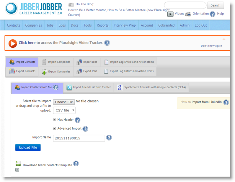
Let me give you a concrete example of friction that we found in JibberJobber. It didn’t take to much effort to find this friction… we even had help from users who emailed us things like “uuuuugh!” and “yuuuuuuck!” and “heeeeelp!” I’m specifically talking about the experience you have when you click on the Import/Export link, under Contacts. Most of the time people click this link to import their contacts from LinkedIn (or Outlook, or wherever). This is what they say, after clicking the link:
Can you tell what you are supposed to do? The main problem I see when I put on my UI/UX goggles is that there are too many things to choose from. You have the main menu (10 or 11 options), gray tabs (11 options), the link on the right, the icons on the bottom… you have LOT to look at. Some people ignore all that and find the Choose File button, and go from there. Honestly, it’s not that hard to do… but there is too much FRICTION. Too many choices. Distractions.
Just like our communication, when we are unclear. We give people too many choices (when we want them to do only one thing, like call us, or go to lunch with us), and we insert too many distractions. It seems like it’s human nature to distract the person we’re trying to communicate with. STOP DOING THIS.
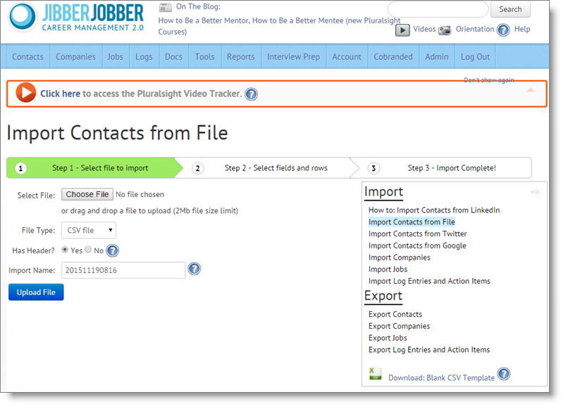
Okay, back to JibberJobber… we’ve been working on redoing the import experience… and here is the new page (which you should see in the next few days):
Of course we still have the main menu (blue bar), but most of the superfluous stuff was moved to a collapsible box on the right. Note the little arrow icon on the top-right of that box – click that and the box collapses, reducing all that noise.
It’s clear where you are at in the process… you are on step 1. It’s also clear what Step 2 is all about, and what Step 3 is all about. The friction has been reduced.
This seemingly simply project took hours of design time (to analyze, come up with alternative ideas, weigh pros and cons of ideas, and prepare communication to the dev team, and then many more hours (weeks, really) for the dev team to clean things up, reengineer the process, etc.
Don’t think that a very, very clean web design (or any design) is the result of a whimsical thought and a few minutes of effort and work. Of course, sometimes that can happen. But think about the difference between Yahoo’s homepage and Google’s homepage. I remember sitting in a computer lab in college, and going to the page I always started with: Yahoo. It was THE de facto landing page. It had news, weather… all kinds of things that you should want when you fire up the internet. Then, someone said “you should start at Google.com.” Goo-what? What is that? So I went there. And all I saw was one search box and one button.
How could one search box and one button replace the ultra-useful information that Yahoo offered? Who came up with this too-simple idea? Apparently it was Marissa Mayer… she was the brains behind the simple page at google. What did she do? She identified why people came (to find something) and reduced EVERYTHING ELSE. No friction. The page was fast to load, and delivered exactly what you wanted: the ability to type something in and get results. No distractions. No noise. Simple, and delivering exactly what the inherent promise was. (It’s funny to note that she was responsible for that brilliant move away from what Yahoo had set up, defining what our internet experience should be… and now she is the CEO of Yahoo :p).
By now you probably get the idea of simplifying, reducing noise and friction. You are bought in. The thing I want you to realize is that the process of getting to a good, clean place is not as simple as you might think. Put thought and effort into it. When you come up with a simplified message, you can help many more people understand you, and how to help you. And that effort is worth it.

“To get the right word in the right place is a rare achievement. To condense the diffused light of a page of thought into the luminous flash of a single sentence, is worthy to rank as a prize composition just by itself…Anybody can have ideas–the difficulty is to express them without squandering a quire of paper on an idea that ought to be reduced to one glittering paragraph.” (reference)
“I didn’t have time to write a short letter, so I wrote a long one instead.” (reference)
“Writing is easy. All you have to do is cross out the wrong words.”(reference)


Hi, Jason-
In the third paragraph, fourth/last sentence, “Is their…?” should be “Is there…?”
Best regards,
Howie
P.S. Will Focus Fridays be coming back anytime?