I recently shared a Craig Delano’s career website with you. The message on that post is that it was a great site, and you could do one like it!
Today I’m going to share one that’s a bit out of many people’s reach, unless they hire someone to help them.
But this is one of the most awesome personal websites I’ve seen: Craig Hobson’s website. Let’s break it down (I’m not going to talk about everything, just a few highlights). I should note that Craig is a professional with web design (and strategy and development).
(click on any of the images to go to Craig Hobson’s website)
First Impressions
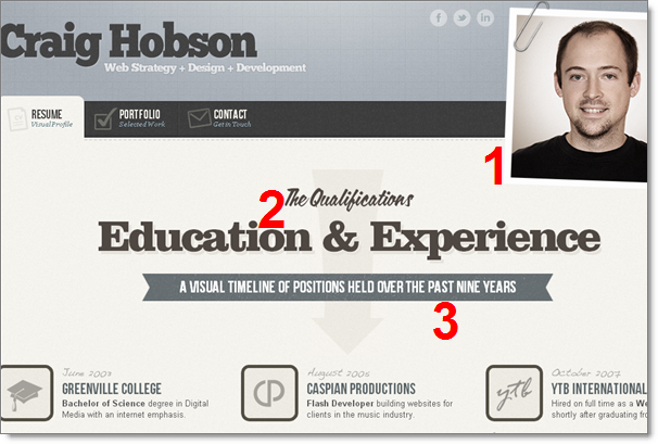
Craig has his name loud and clear, (1) a terrific picture (presented with a paperclip, to give the illusion that I have a printout and I’ve paperclipped his picture on it) that shows him as friendly, approachable, cool, etc.
(2) I love the choice of colors and font… and wouldn’t you expect that from someone who is an expert in… colors and font?
(3) I love that he’s telling me that he has 9 years of experience in this field, and he’s going to show me, visually, what he has done.
Timeline!
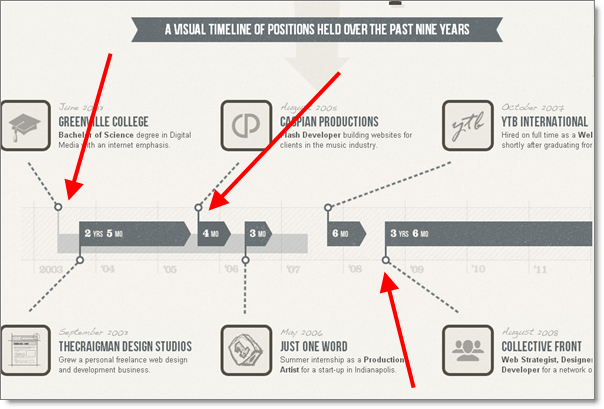
I love how he puts his past work history in a timeline format. This is really brilliant, and easy for me, as a hiring manager, to analyze. Will this stand out from the resumes I get? Definitely.
Testimonials!
Craig has testimonials throughout this page… not just this section (which is fairly high on the page), but throughout the page. Excellent placement. I know you have them…. look at your LinkedIn Recommendations… are you using them as effectively as Craig is?
How proficient are you, really?
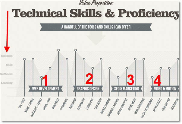
I remember a resume I got a number of years ago… they guy listed about 20 programming languages that he was proficient in. He was a a junior in college. Maybe he was that amazing, but I would have preferred to see something like this… a chart that shows me the level of proficiency (see the levels along the left, under the arrow). To take it a step further, Craig grouped his skills by web development, graphic design, SEO & marketing, and video. Very nice presentation!
Personal Attributes & Strategy
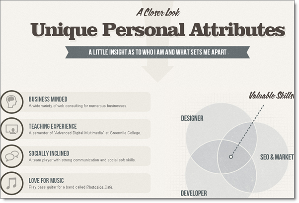
I love this… the website is screaming AWESOME! But this section shows a non-designer, non-technical side of Craig. When I look at this I think “this guy is very strategic, also. Not just a designer waiting for me to give him instruction, he’s going to bring a lot of strategic thinking to the projects!” In other words, this section expands the breadth of Craig’s skills.
The Portfolio
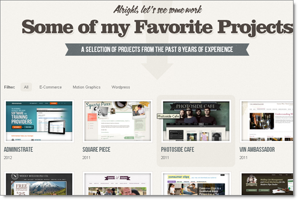
Some of his FAVORITE projects? I love that he has some favorites. He lists a lot… this shows you what kinds of things he has worked on… which is critical. No one is going to hire a designer sight-unseen. You want to know if Craig is any good? Aside from THIS website, check out the projects he has worked on! Even if YOUR work isn’t that visual, can you somehow make it visual, to show off a “portfolio?”
Contact Info: EASY
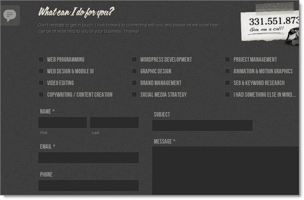
Craig makes it easy to contact him. You can connect on LinkedIn, Twitter or Facebook (icons at the very top of the page), or you can use the form at the bottom… and heck, if that’s too slow, you can call him. Make it easy for people to contact you!
This is really exceptional. I know some of you are thinking “where do I start??” Maybe you can use his contact form to reach out to him, and get a bid (I don’t know if he would take on this type of project for others).
If nothing else, I wanted you to take some ideas from him and see if you can incorporate them into your own online presence!
Thank you Craig, for an amazing example!

