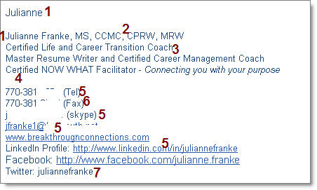
- I think it’s funny when people have an email signature with their name, but they put their name again. It just looks a little funny. I’ve had to get used to having my signature and not putting my name twice on each email.
- This is alphabet soup for job seekers, really. When I was in a job search I didn’t know what any of those certifications meant, and they weren’t significant to me. I have a bias, though… in IT, a few years back, IT certifications were somewhat meaningless. I think it immediately distracts from what your marketing/branding message is by adding stuff that doesn’t make sense to your target audience (perhaps put this down lower?).
- The two lines under her name are good – they give me information about her and what she does. Too often this is jargon, and people might not understand what it really means. I’ve started to tell job seekers they should try and say “I help people/companies _____ by ______.” with NO jargon or cliche.
- I don’t know what a NOW WHAT facilitator is or does — even putting “connecting you with your purpose” doesn’t help me get it. Can you say this in simple English, so I can immediately get it?
- Telephone, skype, email, websites, LI and FB profiles are all good and perhaps appropriate. My only concern is that this is a very long email signature, and I think the longer it is, the less likely it will be read in it’s entirety… which means people might miss your branding message.
- Fax? If you take anything off, I’d take this off, since it probably is important to less than .5% of the people you email. And if it is important you can simply email it to them, without cluttering up your branding message.
- This was a gotcha…! Many people would put @juliannefranke, but you didn’t. I would suggest people who ARE on Twitter would be fine with an @, and not to put Twitter: ____. People who ARE NOT on Twitter will likely not know what to do with this handle. It also isn’t a hyperlink – either put @____ or put the entire URL (so it becomes a hyperlink).
Overall I think it is a good email signature, but go back to these points and you can see some opportunity to really tighten it up 🙂


Jason,
Thanks for your helpful comments. I’d like to respond to a couple of your points:
1) Repeating my name when the signature already states my name.
Although it may seem redundant, in my opinion, it seems cold not to put a closing salutation. To me this is an important part of establishing a quality relationship through email communication.
2) Credentials after my name, perception of them as “alphabet soup.”
I agree that to many job seekers, these are meaningless, but I have spoken with high level professionals and executives who said they decided to do business with me specifically because they were impressed with the number of certifications. To them it meant that I was invested in improving my credentials and ongoing knowledge of my field. And I am looking forward to adding your LinkedIn Certification to my list, although I will be sure to spell it out.
Your other comments are excellent and points well taken. I do agree with your branding suggestions and will work on making mine more powerful, concise and easy to understand.
Thanks so much Jason for all you do to help professionals like me, but most importantly the job seekers who have unquestionably benefited from your free advice and information sharing. Your technology genius, completed by your branding expertise, has taken job searching to a new level by successfully integrating traditional job strategies with technology and social media.
For anyone considering taking Jason’s LinkedIn certification course, I highly recommend it. Jason makes learning a complex technology fun and easy and he is always available for questions.
Thanks again Jason for sharing and supporting us,
Julianne Franke
Jason,
What a great new feature for your blog. I’d be interested to see more of these. It’s helpful to see Julianne’s actual email signature and get a real visual as you walk through the steps for what is and isn’t working. In theory, this should be fine, right? It’s got all the necessary information someone might need about her social media presence, contact info, certifications, etc. But so much information actually detracts from the purpose of the email signature, which is to allow someone to easily get in touch. I believe a lot of people make this mistake, to their own detriment. Thanks to you and to Julianne for allowing her signature to be put on display.