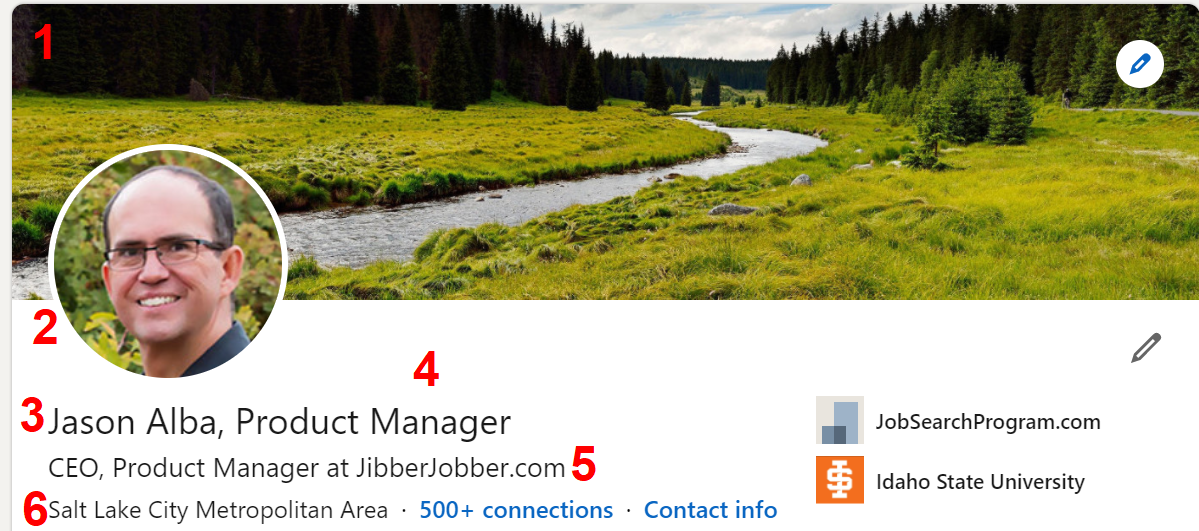
I’m diving into my Pluralsight Personal Branding course to redo it for early next year and thought it would be a good time to look at my LinkedIn profile. I like my header, and figured it is a good time to share what I like about it. As I go through this, think about what your header looks like. One of my main messages is to do your branding intentionally.
So here we go, with some elements of my intentional branding on my LinkedIn profile header.
#1: The “Background photo”
Many profiles I see have the default background, which is FINE. Don’t stress about this. Some really cool background photos are extremely branded, with key words that communicate the brand. Those are custom-designed images (maybe you can make your own with a simple/free app like canva).
For a long, long time mine was just the default. When I talked a lot about multiple income streams, though, I finally realized I could (should?) put a background image that reinforced my interest in multiple streams.
I didn’t find an image I liked with MULTIPLE streams, but this was good. Plus, it reminds me of a really cool place I went to in Wyoming. It’s just peaceful. I doubt many people will get the subtle connection to multiple revenue streams but that’s okay with me. It looks nicer than the default image and it sparks joy.
Two sites to look for free images that might work for you (and your brand) are pexels and unsplash. Be careful you don’t do something crazy busy or weird. The point is to have something onbrand, not have people scratch their heads and wonder what the image has to do with your brand.
#2 YOUR picture (avatar)
This is really, really important. I talk about this in my course, and my LinkedIn profile course. Without going into detail, or the “why” of any of these, please make sure your image: is a closeup of your headshot; has a clean or uncluttered background; is approachable (SMILE!); doesn’t have weird or yucky or contrasting colors.
Bonus: Use the same image here as you do on other social sites. The consistency will ensure people know they are in the right place, as they go from profile to profile.
#3 Your name Part I
I encourage you to put the name people call you here, not your entire legal name. If your name has like 5 syllables but people call you “Tom” then put Tom! This should be consistent in all of your online marketing assets so people don’t have to wonder if they are looking at profiles for the same person.
#4 Your name Part II
In my “last name” I put: “, Product Manager”. This was very strategic because the name field is apparently higher weighted with searches, and at one time I wanted to show up higher in product manager searches. (I just gave you a really important tip to show up higher in search results)
# Your headline
I talk a lot about this in the LinkedIn course, and why and how to change this. This is a super important little snippet to update. By default, if you don’t update it, it will just pull in your title and company, like “Dishwasher at Big Company”.
I want you to be more strategic in what you communicate than your title and company. Mine looks like title(s) at company, but that is because I wanted to brand myself as a CEO and a product manager, while also increasing brand awareness of JibberJobber.
I might call this section the tagline, and LinkedIn used to call it the professional headline. I like “tagline” because you can (AND SHOULD) use whatever you come up with here anywhere else you use a tagline (even verbally).
#6 Your location
For many years I put something like “global” or “online”. One day, though, I realized that it just didn’t matter anymore. I was trying to convey that JibberJobber was global, but then I realized people just wanted to know where in the world I was (not my services). So, put where you are.
IF you are mobile, open to moving to other locations, and are concerned hiring managers recruiters won’t want to relocate you, communicate that elsewhere (perhaps in your Summary). Something like:
I’m open to opportunities in Seattle and Miami,” or “I work with clients in Boston and Austin.” Either of those help me pull you out of just one geographic location and help me know you have interest or business in other locations.
So that’s it… a quick look at WHY I have my header the way I do. It’s all on purpose, just as yours should be. Check out the links I put in here for more information, especially the LinkedIn course.

