Last year when I was working with Udie, my UX guy in San Francisco, I learned that on a page, every field that you have to enter something presents a choice… and one of our goals is to reduce the choices.
No, this isn’t a political statement… it’s simply a design technique to help clean up websites that are too confusing.
When we started working together he said, “Jason, one thing I’m going to do is take away a lot of stuff from JibberJobber.” Ugh, I thought… I don’t want to be like that company that takes away features that people use and love!
He wasn’t talking about taking away (and retiring) features… he was talking about cleaning up each page so it isn’t confusing, rather it’s closer to a single-purpose.
Don’t worry, we’re not going to take away the power of JibberJobber… but we are on a mission to clean things and make each page more intuitive. And, where we can, make the site look more updated.
And that’s why we have worked on updating the landing page (and static, logged-out pages) of JibberJobber. There’s one change we made that, years ago, I would not have done… but every single thing we have on this page is where it is for a reason. I hope that these changes continue to move us closer to the target. I won’t pretend that we are done, or “this is it,” but I think this is a really good move in the right direction.
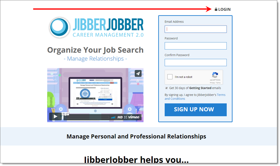
The most important thing to realize is that if you are going to login (and you already have an account), you need to click the login link at the top-right. The form that’s on the front page is to create new accounts, not to login to your existing account.
Well, that’s it. This update doesn’t impact the functionality of JibberJobber, but I hope it has an impact on new signups!
Thanks for your support, we’ll be releasing some other new features soon!