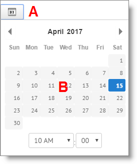
I blogged a couple of weeks ago about fixes we were implementing to make JibberJobber faster and appear more modern. One of those fixes is now on the live site…. the new calendar widget. It’s simple, as it should be, and it’s faster than the old calendar widget. If you pop up a calender widget, and it doesn’t look like this (click on the calendar icon (A) and you’ll see the widget (B), let us know so we can update it:
This calendar is from the Log Entry view…. now, this seems like a meaningless update, right? Maybe not that important?
Well, I agree that it is a small update. But the reason it’s updated is not small.
We want JibberJobber to load fast for you. And shaving everything down that we can will help. This is one more little thing we are doing to enhance your experience.
I call any problems that users have “friction.” More on that later, especially how it applies to your job search and marketing.
Find a place with the old calendar? Let us know so we can swap it out!


1 thought on “Calendar Widget Update”
Comments are closed.