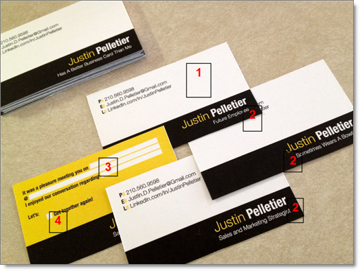
I got a delightful email this week from someone who saw me talk about a year ago in San Antonio. Justin Pelletier is an account executive going through a transition. He shared his new business cards, based on some things I shared with him in the presentation. What do you think? I’ll tell you what I love about this below the image.
I LOVE the color choices. Things just pop out… in addition:
- Lots of white space. People say they like to write on business cards but sometimes there is too much writing and they can’t. I agree with that. I also like how he chose to NOT put every characteristic about him on the card, which I think just adds noise.
- COOL titles! They are different… and include: Future Employee, Sometimes Wears a Bowtie, Sales and Marketing Strategist, and Has a Better Business Card Than Me. 3 plays on HUMOR, and one that supports his professional brand. I LOVE IT!
- On the back, he PROMPTS you to take notes so you have the meeting in context. I love this… it shows what kind of relationship he wants, and what kind of networker he might be (he’s setting the bar high, as I would expect him to FOLLOW UP with me).
- Check out the options at #4… “Let’s:”… and then there is only one option: Get together again! Isn’t that cool?
Great job Justin, I love it! These will be very memorable business cards, and people will talk about them!
For more, check out Justin Pelletier’s LinkedIn Profile.

