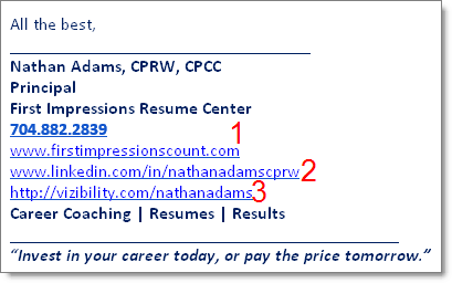
Nathan Adams is a resume writer out of Charlotte, NC. We recently exchanged some emails and after looking at his email signature about three times I was struck with something that I didn’t like. I didn’t catch “it” the first two times, but he said something in an email that made me more critically think about what I didn’t like…
When I speak across the country to job seekers I talk about your brand messaging, and how “every character either supports, or detracts from, your brand.” EVERY SINGLE CHARACTER.
Nathan wants people to go to the most important place, if they are interested in a resume critique or rewrite.
Which of the links on his signature would YOU say is the most important place? Is it 1, 2 or 3?
Nathan wants you to look at his resume writer (and career coaching) services.
The first link, #1, does that. It sends you to his website, First Impressions Count.
The second link, #2, kind of does that. It sends you to his LinkedIn Profile. That’s okay, but my hangup with that is the formatting and ads on the Profile that he has no control over. I just clicked there and the add on the right is actually a video that is visually distracting. I recommended he keep this because he does LinkedIn Profile rewrites, and he needs to show he gets LinkedIn, so it’s fine. For most people, who don’t have another website, I think it’s fine. But if you aren’t in the career space, or your clients are job seekers, I would think twice about putting your LinkedIn Profile on your signature. My Profile URL is not on my signature.
The third link, #3, … does nothing for me. In fact, it is worse than nothing. This is message-distracting. Click here to see Vizibility’s formatting, and the information you get from that link. Is that going to help you understand Nathan’s service? If nothing else, it points you to a page where you have to choose from five or so other links, and you aren’t likely to get to a page that helps you become a customer. From a branding perspective, this is not neutral, it is negative.
To take the links to the next step, I recommended he did one more thing… send people to a special landing page that isn’t his home page. This would be a page that said something like “Hey, you got here from clicking on the link in my email signature. Welcome! Here’s what I want you to know….” Something similar to what I have on my business card… the only link goes to this special landing page: JibberJobber.com/pink
This might seem like harsh advice, but you have to consider how many options you are giving people, and what the message is that they get.
Are you doing your email signature on purpose, for personal branding? I hope so.
More email signature thoughts here.


Jason,
I agree with you that #3 is distracting but more importantly is “ugly” formatting.
I disagree with you on #2. I never notice the LinkedIn ads. Which is why LinkedIn ads are such a poor investment. 8^(
Marc Miller
Marc, thanks for weighing in.
I personally believe that every single character on a page either reinforces, or distracts from, the branding.
My beef with LinkedIn profiles, in general, is that you have control over very little of the formatting, and what the viewer sees, on the page.
I agree most people disregard the ads, which is common all across the internet… but it’s still not my favorite display of a person’s message/branding.